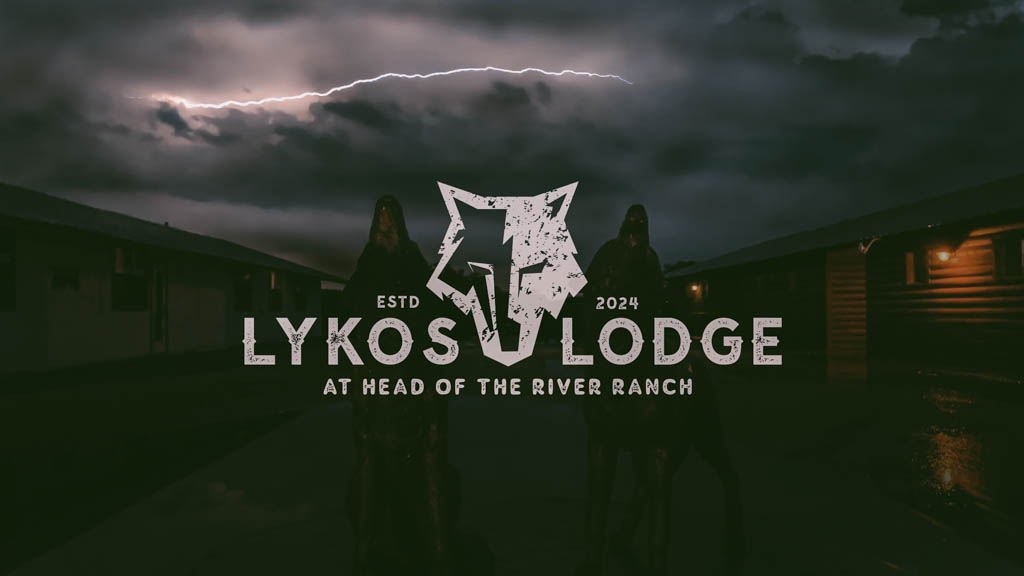
Lykos Lodge
Lykos Lodge approached needing more than a request for a logo...they sought a visual language that would transform an East Texas hunting property into an exclusive sanctuary where business relationships evolve into lasting partnerships.
BRAND
Identity
Crafting Luxury Through Primal Symbolism
The Strategic Challenge
When tradition meets transformation, brands discover their true power.
The challenge wasn't just creating an identity; it was architecting an experience that whispers luxury while roaring with authenticity.
The brief seemed simple: create a wolf-based identity for a hunting lodge. The execution would prove anything but.
The Discovery: Beyond the Surface
Understanding the Real Business
In the spirit of true strategic design, we recognized that Lykos Lodge wasn't selling accommodation—they were orchestrating transformative experiences. This wasn't about hunting; it was about the primal connection between leadership, land, and legacy.
Through strategic conversations with the CEO and marketing director, we uncovered the deeper narrative: a space where C-suite executives shed their corporate armor and forge authentic connections in nature's boardroom. The lodge would serve three distinct audiences:
- Personal retreats for the leadership team
- High-stakes relationship building with potential clients
- Exclusive experiences that communicate success without saying a word
The Brand Strategy: Refined Predator
Positioning at the Intersection of Opposites
Drawing from the Greek "Lykos" (wolf), we identified a powerful dichotomy: the sophisticated savage. Our strategic framework crystallized into a single phrase that would guide every design decision: "Refined Rustic."
This wasn't mere wordplay—it was a commitment to holding two truths simultaneously:
- Luxury that doesn't apologize for its connection to the wild
- Authenticity that doesn't compromise on excellence
- Tactical precision wrapped in Texas hospitality
The Research Revelation
My approach diverged from conventional hunting brand aesthetics through strategic research into parallel luxury markets. While others saw "hunting lodge," I saw the intersection of:
- Whiskey River's Texas chic sophistication
- Tactical gear's functional precision
- Heritage hospitality's warm authority
The challenge: Create an identity tactical enough to respect the hunt, refined enough to close deals, and authentic enough to build trust—without defaulting to another hunting product logo that belonged on a gun case rather than a boardroom.
The Design Process: Iteration as Innovation
Multiple Perspectives, Singular Vision
The creative journey challenged conventional agency hierarchy. When initial concepts from senior designers missed the mark, we embraced what Collins would call "productive collision"—allowing fresh perspectives to challenge established thinking.
The Strategic Pivot: From Full Body to Focused Power
Through tactical questioning and research, we uncovered a critical insight from the CEO—he craved uniqueness beyond the expected full-body wolf silhouette. This constraint became our catalyst. The solution emerged through geometric deconstruction:
The wolf head, split between positive and negative space, creates a visual metaphor for the lodge experience itself—where executives shed one identity to reveal another. The angular construction suggests tactical precision while the organic flow maintains primal connection. This isn't illustration; it's architecture.
Typography as Cultural Bridge
The font selection became an exercise in cultural diplomacy. We needed letterforms that could:
- Command respect in a boardroom setting
- Feel authentic against weathered wood and steel
- Create breathing room for the geometric wolf to dominate
- Perform equally on CNC-cut metal signs and embroidered apparel
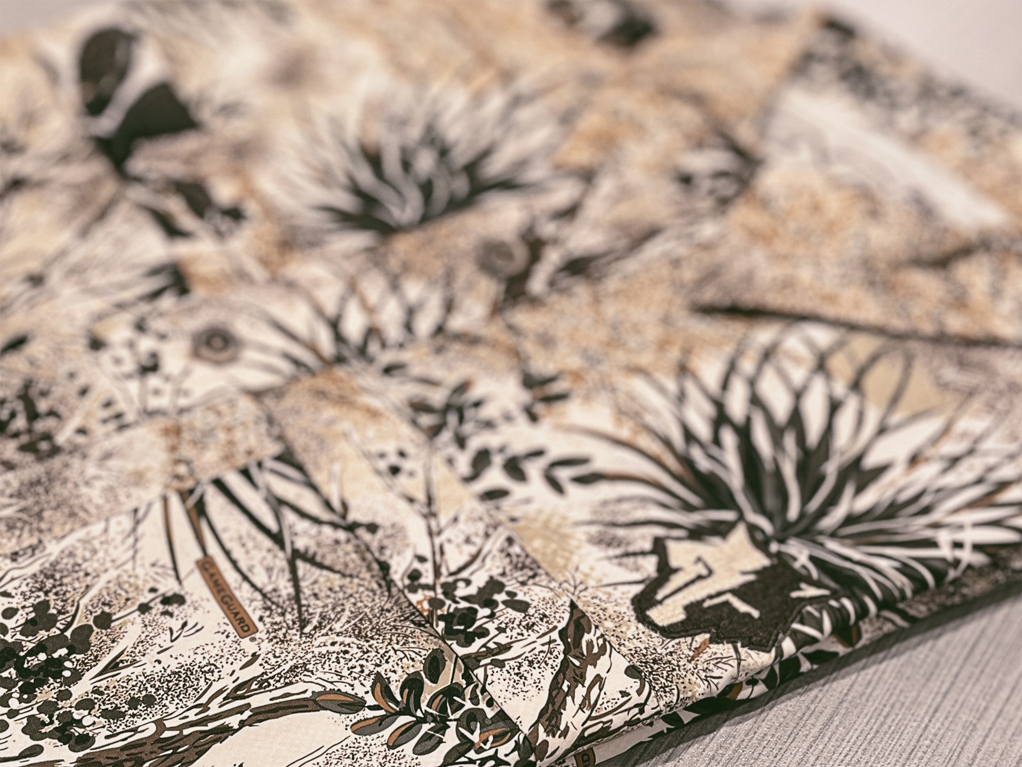
The solution: weathered sans-serif capitals that whisper authority rather than shouting it. The distressing isn't decorative—it's earned, suggesting a lodge that existed before it was built.
Environmental Design as Brand Proof
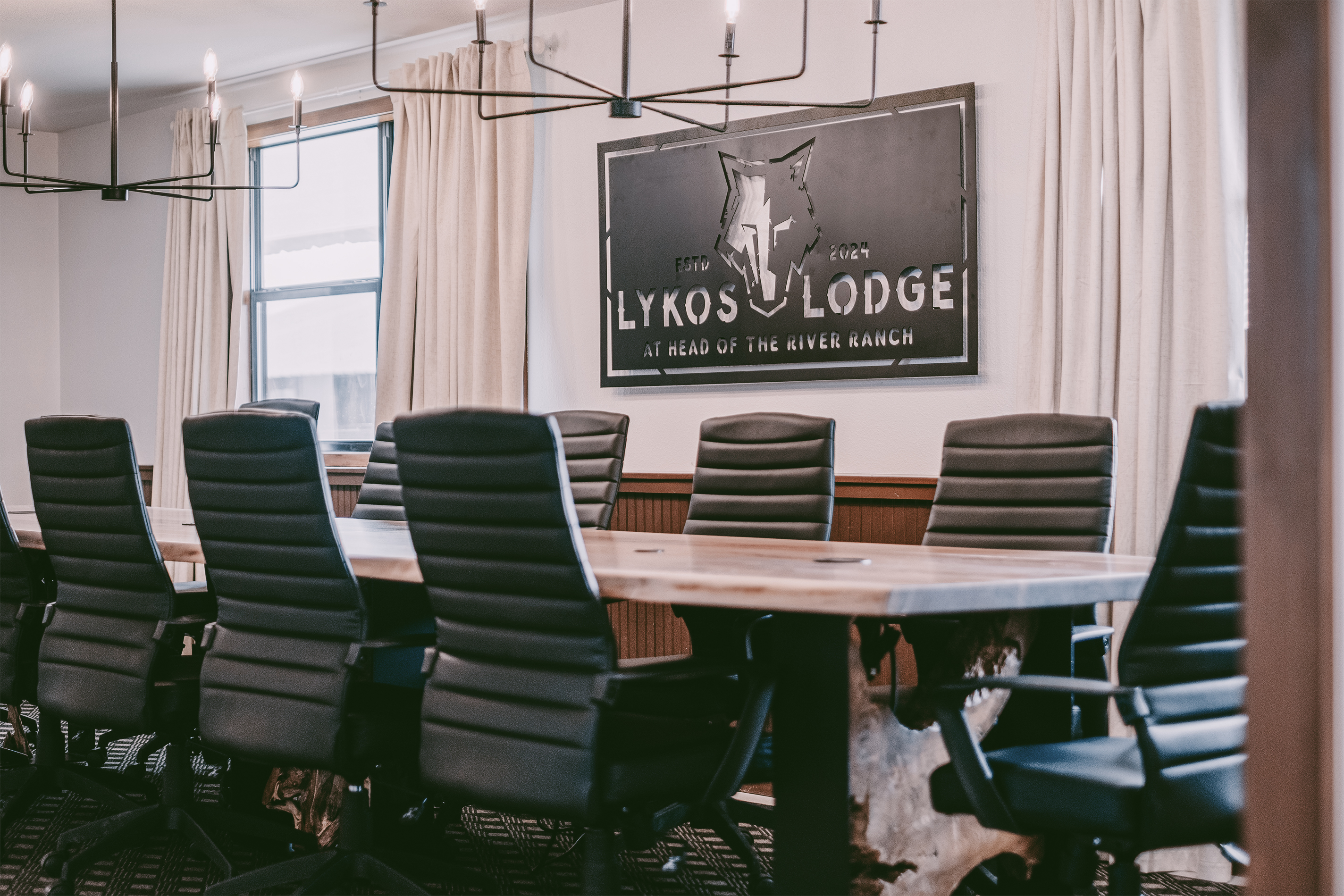
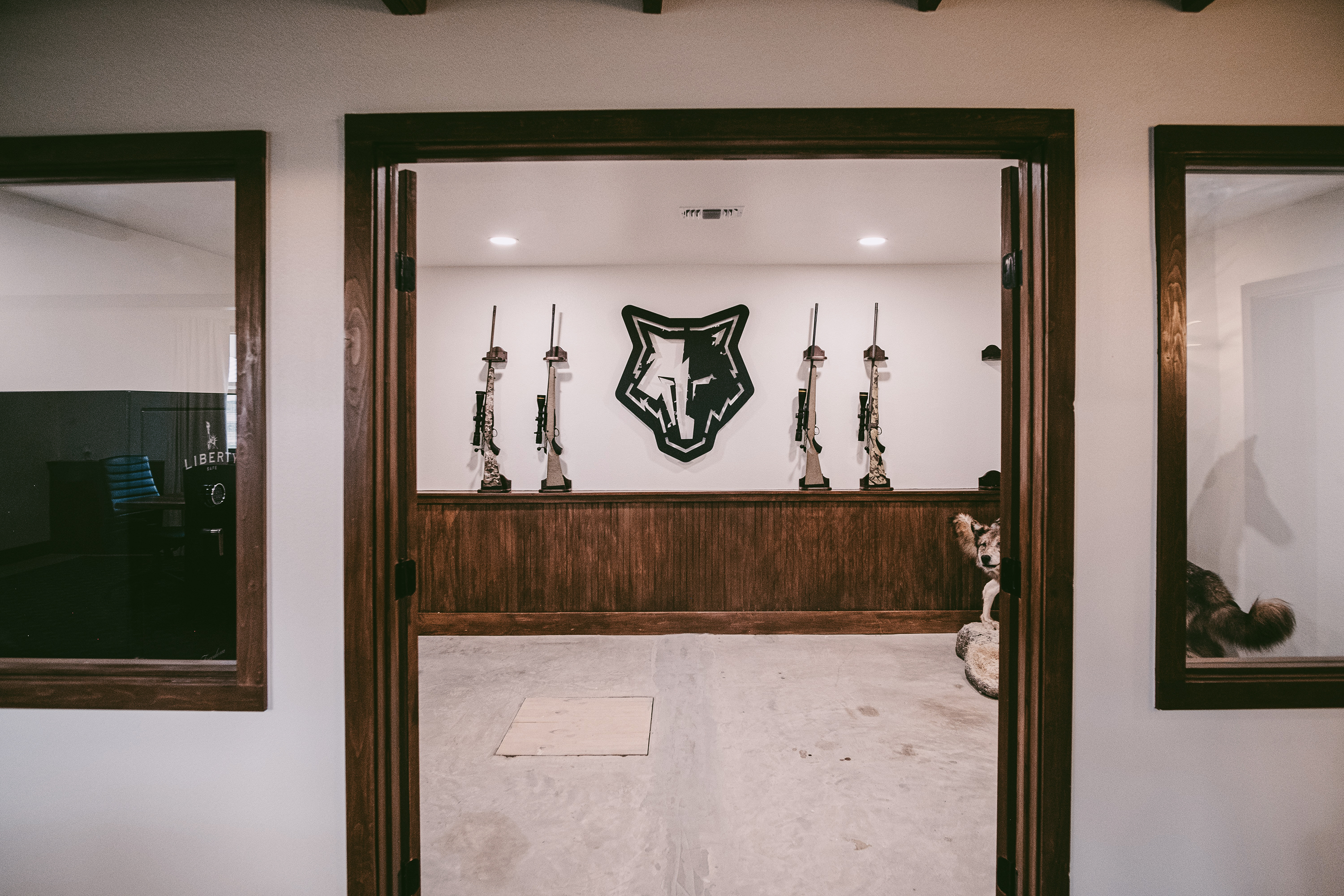
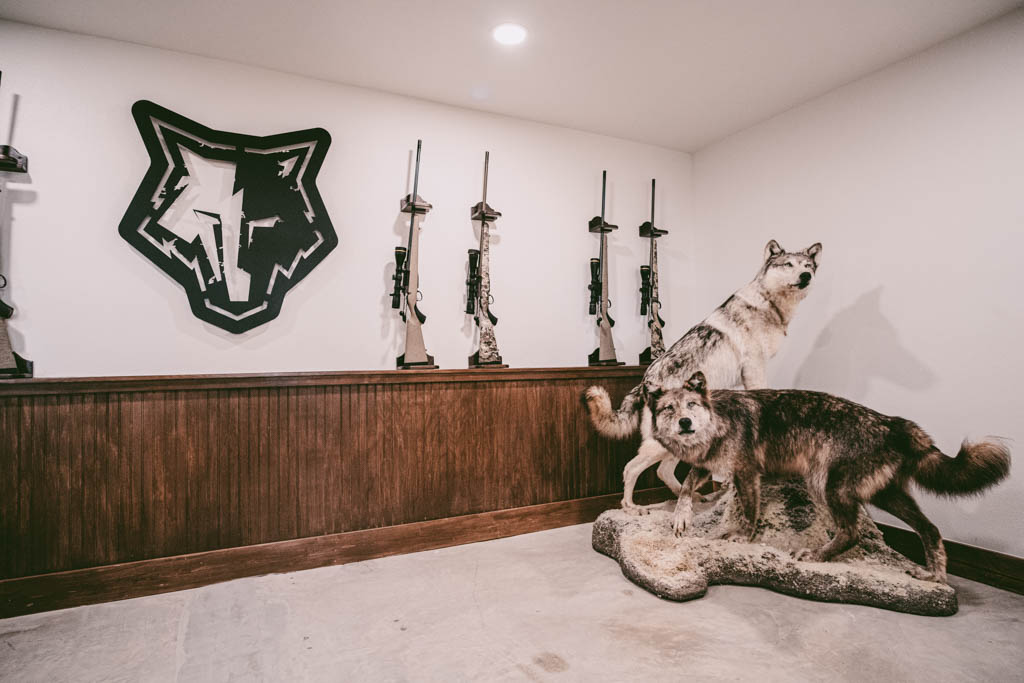
The true test came in situ. The conference room installation—geometric wolf presiding over leather chairs and tactical lighting—proves the concept. This is where million-dollar handshakes happen under the wolf's watch. The lodge's gun room, where the mark shares space with mounted game and precision rifles, demonstrates perfect tonal calibration between reverence and relevance.
The Vendor Partnership: Crisis as Opportunity
Turning Obstacles into Trust
When a vendor error threatened to derail gear production, we transformed a potential disaster into a demonstration of our value. By navigating the complex communication between vendor and client, we:
- Brokered a fair resolution that preserved relationships
- Maintained quality standards without compromising timelines
- Proved that brand stewardship extends beyond pixels and paper
The Visual Identity System
Architecture of Exclusivity
The final brand system operates on multiple levels of sophisticated simplicity:
Primary Mark: A geometric wolf head—focused, tactical, unmistakable
- Angular geometry creating negative space that suggests both presence and absence
- Strategic grunge texture overlay adding earned patina without manufactured distress
- The wolf's gaze directed forward—always hunting, never hunted
- Split composition creating dynamic tension between light and shadow
The Material Intelligence
The mark's genius reveals itself across applications:
In the Boardroom: The conference room installation demonstrates the power of context. The metal sign, weathered black with white relief, transforms a corporate space into a war room. Here, deals aren't made—they're won.
In the Lodge: Against weathered wood paneling and tactical displays, the geometric wolf holds court among rifles and taxidermy, proving that modern design can honor tradition without mimicking it.
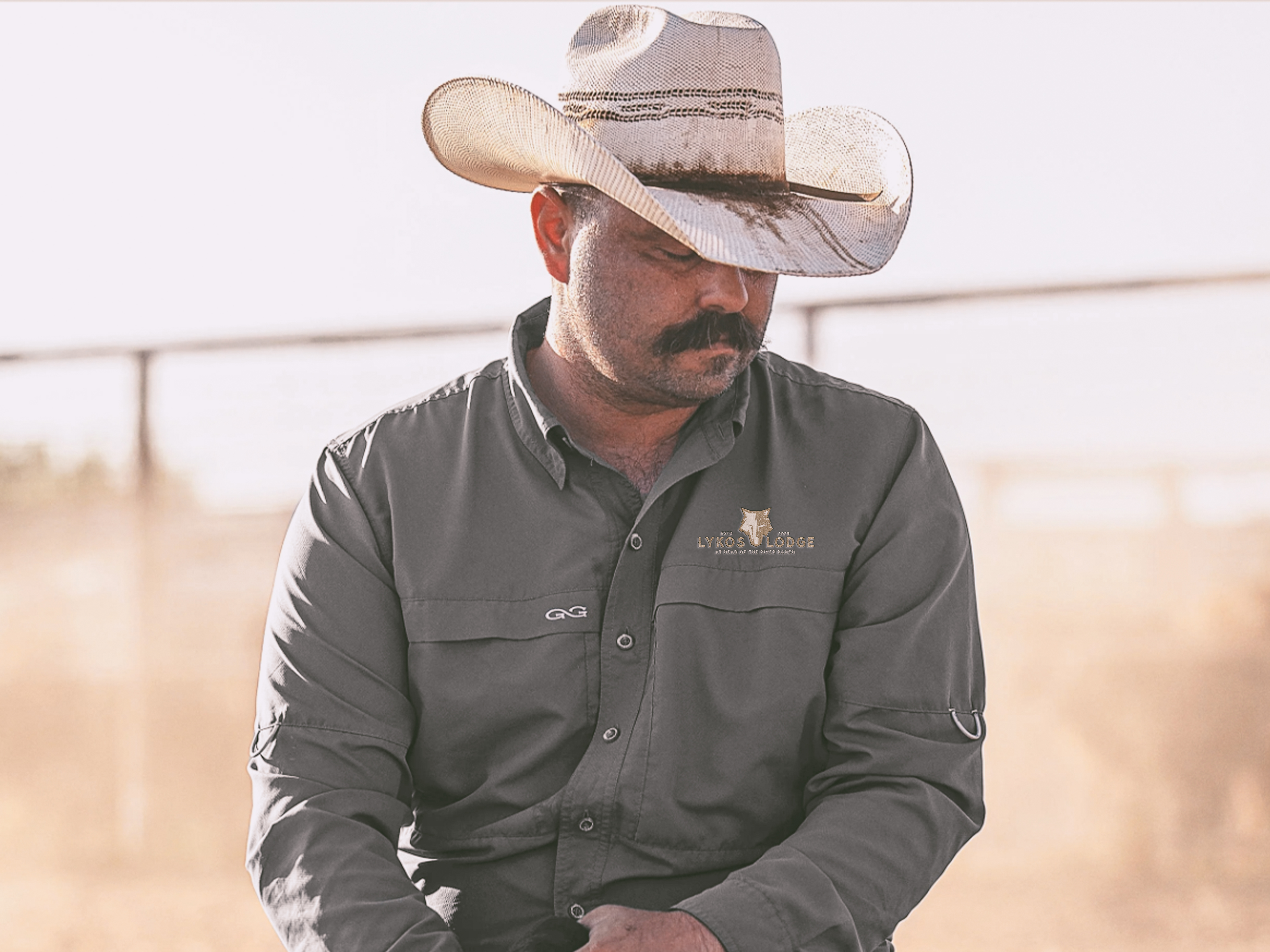
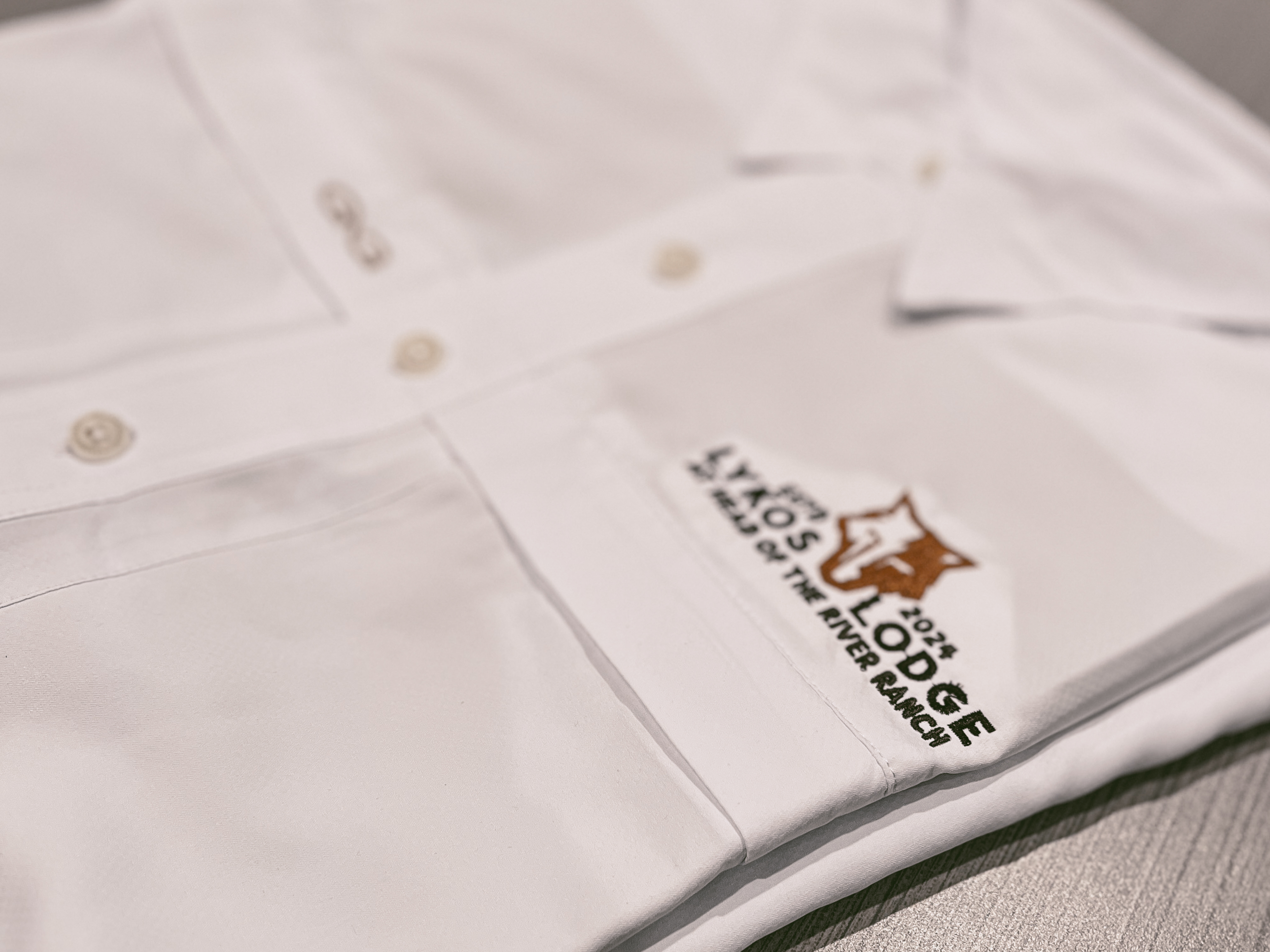
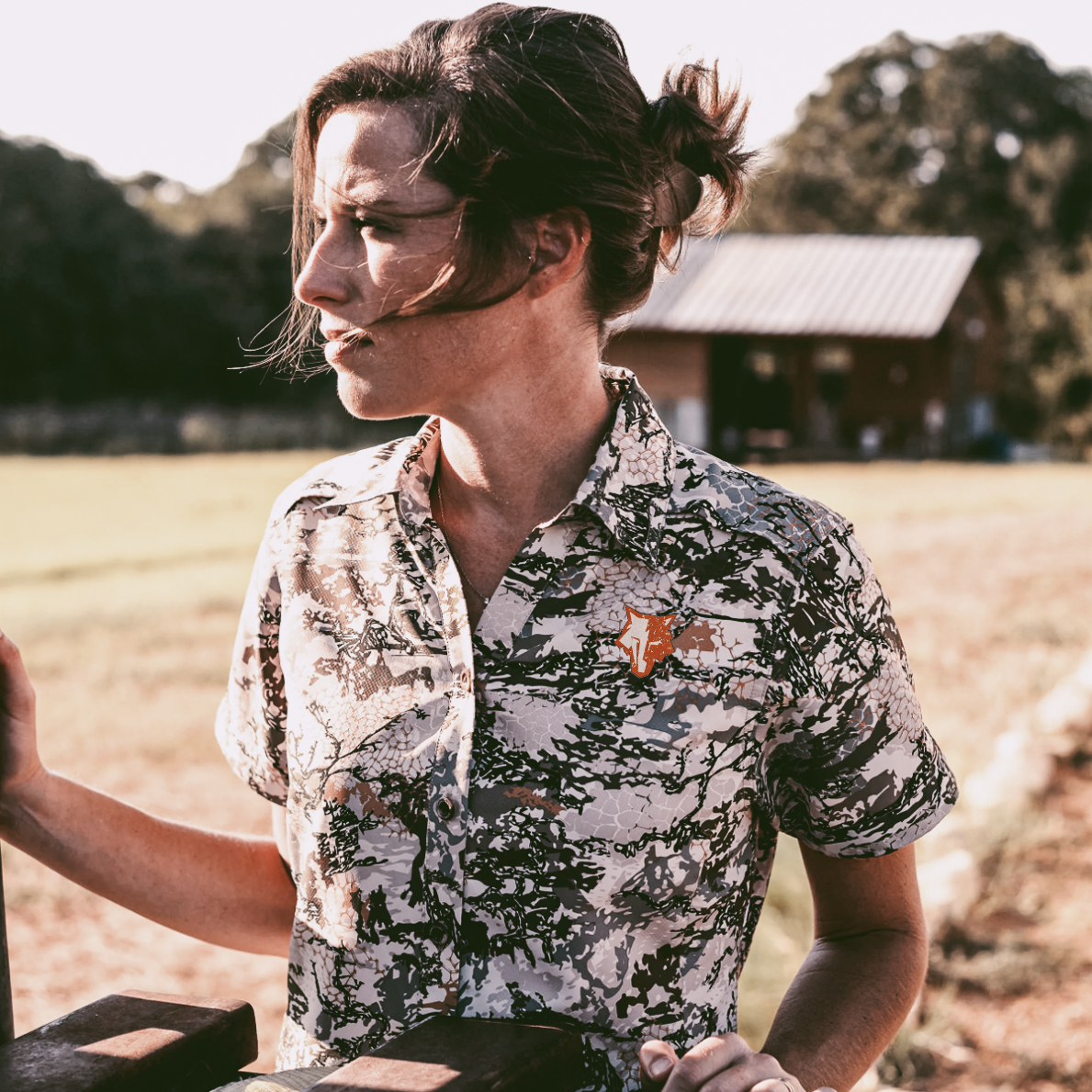
On Fabric: The embroidered applications show remarkable translation—angular lines becoming textile architecture, maintaining clarity whether on structured caps or soft goods.
Digital Presence: The mark scales from massive wall installations to social media avatars without losing its predatory precision.
Color Strategy: Restraint as luxury
- Deep forest black as primary—absence of color as presence of power
- Weathered white for contrast and legibility
- Natural wood tones and tactical grays in environmental applications
- The conscious rejection of expected "hunting orange" or forest green clichés
Typography: Purposeful hierarchy
- "LYKOS LODGE" in weathered, sans-serif capitals—institutional without being institutional
- "AT HEAD OF THE RIVER RANCH" as supporting descriptor—grounding the mythological in geographical reality
- "ESTD 2024" flanking the mark—instant heritage for a new venture
- Letter spacing that breathes authority without shouting
The Results: Measurable Transformation
From Logo to Leadership Tool
The brand identity achieved what great design must—it became a catalyst for business transformation:
Immediate Business Impact (Year One):
- Generated multiple high-value business hunting trips
- Facilitated strategic sales meetings in an elevated environment
- Enabled leadership team alignment sessions
- Drove over $50,000 in premium apparel and gear purchases
- Created a visual vocabulary that commands premium positioning
Cultural Resonance:
- Executives proudly displaying gear as status symbols
- Organic brand advocacy without prompting
- Elevated perceived value before physical lodge completion
- Transformed from service provider to relationship architect
The Three-Month Sprint:What typically takes six months, we delivered in twelve weeks—not through shortcuts, but through strategic focus and decisive iteration.
The Learning: Humility in Hindsight
What Excellence Demands
Every project teaches. This one reinforced critical truths:
- Brand guidelines before production—structure enables creativity
- Direct stakeholder access—middlemen dilute vision
- Vendor relationships as brand extensions—quality control extends to every partner
- Multiple formats from inception—anticipate application challenges
- Color theory as business strategy—every choice communicates value
The Deeper Impact: Design as Business Transformation
Lykos Lodge demonstrates what Neumeier calls "the brand gap"—bridging strategy and design to create meaning. This wasn't about decorating a hunting lodge; it was about designing a crucible for relationship transformation.
The geometric wolf head has become more than a logo—it's a behavioral cue. In the conference room, beneath its watchful geometry, executives unconsciously straighten their spines. The split composition—half revealed, half suggested—mirrors the lodge experience itself: what you see is only half the story.
The installation speaks volumes: rifles displayed with museum precision, the wolf presiding over both boardroom and bunkhouse with equal authority. This is design doing what Collins advocates—making transformation visible. Every touchpoint reinforces the central promise: here, business isn't separate from life; it's elevated by it.
In choosing geometry over illustration, weathering over polish, presence over prettiness, we created a visual language for a new breed of business—where handshake deals still matter, where relationships are forged not in elevators but in deer blinds, where success is measured not just in numbers but in stories that start with "Remember that time at Lykos..."
The wolf doesn't howl. It doesn't need to. Its geometry speaks louder than any war cry—angular, uncompromising, unforgettable. This is what happens when tactical precision meets Texas soul, when business meets brotherhood, when design transcends decoration to become destiny.
"Design is hope made visible. In the case of Lykos Lodge, we made visible the hope that business can still be personal, that luxury can still be authentic, and that sometimes the best boardroom has no walls."